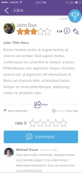
Ajokeaday, while having a sizable readership, had an aging web presence. They were interested in revamping their website as well as making a native mobile app that not only served content but had community features for its users.
By the end of this project over 50 different UI views were made for the mobile app. In addition, dozens of pages were designed for both their flagship website as well as tertiary sites of their network. From hand crafting a number of original vector illustrations to designing their email campaign; this project envisioned a completely new look and function for the brand.
Illustration
The client wanted something unique to get users attention and highlight the lighthearted feel of the site. A few mascots were hand illustrated for the Ajokeaday brand in order to communicate the brand message.

UI/UX Design
Design began with the mobile application. A design was made for each view planned in the app and then various user interface states were made based on those base view designs.
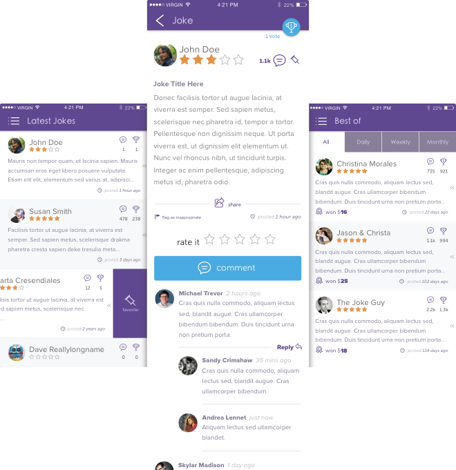
The first phase of the mobile app design largely centered around content views. A great deal of functionality needed to be available in when viewing pages that had joke content or listed multiple jokes. This had to be done in a way that made functionality obvious but without overwhelming the user.
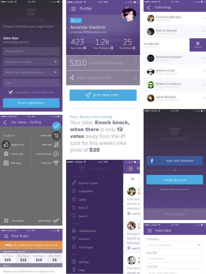
Other views introduced additional functionality. Like sorting/filtering jokes, managing your profile, following other users and adding your own jokes. All of these features had various states based on whether the user was logged in, had submitted a joke into the prize entry or had used one of the various content filters.
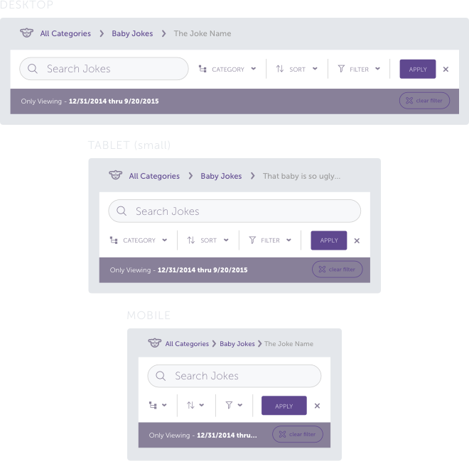
Next came work on the website. Since the desktop experience needed to have a similar look and feel to the mobile app, many of the elements used in the app were reimagined for a responsive web experience.

Web Design
With the components in place, the rest of the responsive desktop experience came into place. The website would be the initial point at which potential users would come in contact with the service. So the web presence would need to both serve content and explain what the site was all about.
The homepage was required to show a joke, offer an area to signup and offer incentive to use the service. All above the ‘fold’ (the area of the page most people would initially see).
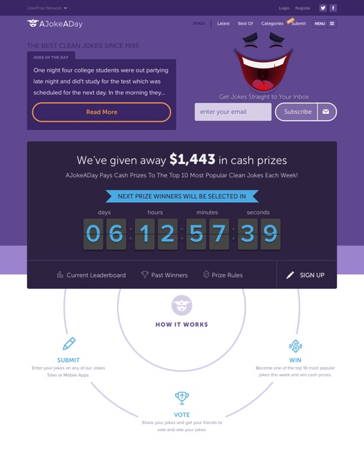
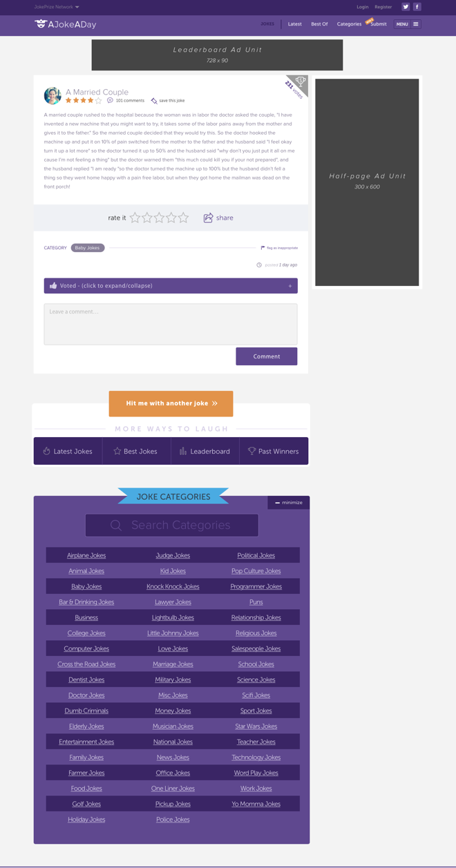
Other pages needed to have space for ad units. But unobtrusive enough where other core functions could co-exist along side them.
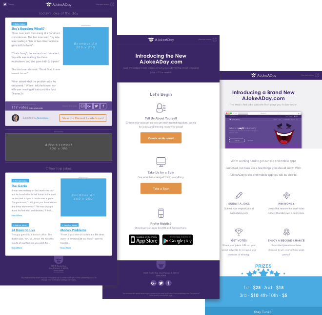
Once the application and website were completed, work was done designing various templates for the email campaign.
Results
As a result of the successes of the redesign, the company later implemented the new design across several other sister sites in their network and plans to expand it use even further.
